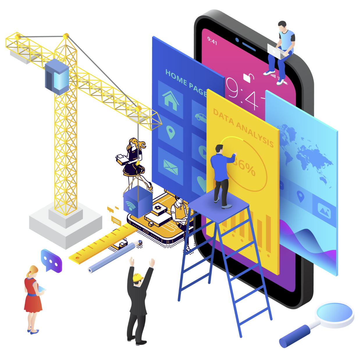
Layouts
Red Fish promotes a compact and clean representation of your modules, displaying the wallpaper prominently. The modules will be presented through a transparent circular animation that gives a dynamic appearance to your App. The configuration options include the position of the menu to access your modules, size of the icons and font in pixels, the height between lines of the modules, among others.
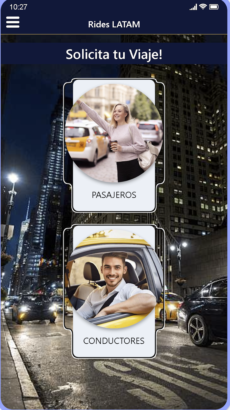
Made for applications aimed at a taxi service, or delivery like Uber, Indiver, Cabify among others. It consists of a default module that will always be active, and a drop-down menu at the top left of the screen for the passenger and driver. The background image can be changed from the module configuration section.
Layout that can be used in general for any type of App. It consists of a list in the center of the screen in which the different installed modules are shown, the configuration options include a carousel or image slider, positioning of the titles and modification table borders
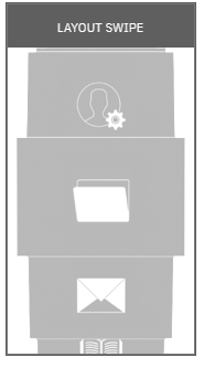
In this Layout, your modules are presented in folder-type boxes, and they can be slid vertically located in the center of the screen to access each of them. You can use it in general for any type of Application. You can configure the angle, the depth and also choose between different box alternatives.
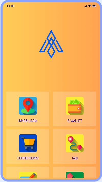
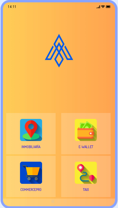
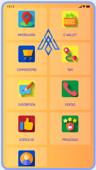
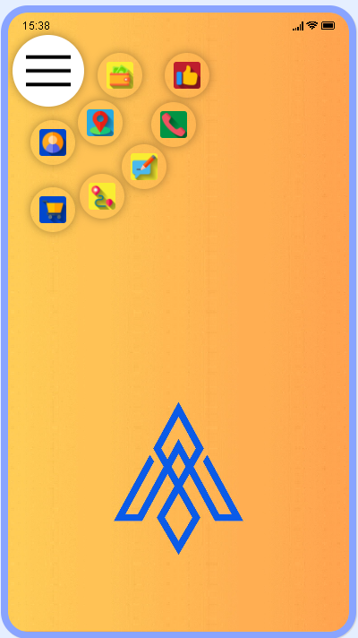
It presents the user with a menu with all the modules in the form of icons that are displayed in the center of the screen, and you can configure it to appear at the top or bottom of the screen. When you press the main icon, the menu is formed around you in a circular shape. You can use it in general for any type of Application.
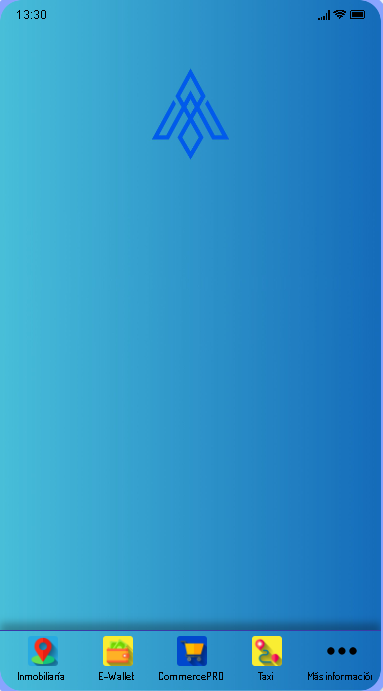
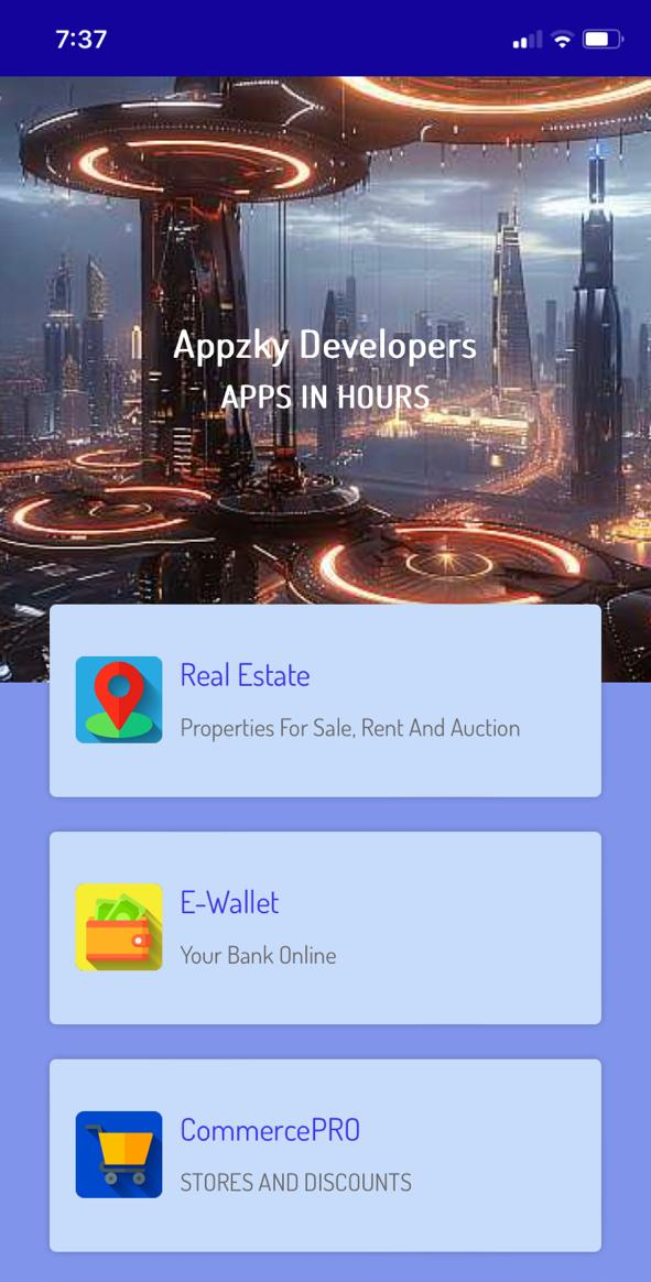
This Layout is one of the most used due to its traditional format. It allows you to leave the background of the screen mostly visible, it presents a bar at the bottom of the screen in which the configured modules are displayed, the rest of the modules are accessed through the 3 points at the bottom right. You can use it in general for any type of Application. You have the option of enabling an image carousel to show your users promotions, messages, new products and any type of message that is appropriate to convey to your audience.
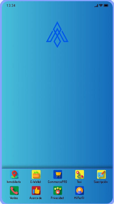
Similar to Layout 1, with the difference that two lines of icons are presented instead of just one. Likewise, it allows you to leave the background of the screen mostly visible, it presents a bar at the bottom of the screen in which the configured modules are displayed. You can use it in general for any type of Application. There is no option to add an image carousel.
General Layout that shows the configured modules in the form of boxes at the bottom of the screen. You can use it in general for any type of Application. It has a slider or carousel of images.
General Layout is a variation of Layout 3, its distinction is that when you place the modules, they will appear progressively, until they occupy the entire main screen. You can use it in general for any type of Application.
General Layout, in which the modules appear at the bottom of the main screen, in a series of small circles. It lends itself to use in any application. It has a slider or carousel of images.
General Layout is a variation of Layout 3, its distinction is that when you place the modules, they will appear progressively, until they occupy the entire main screen. You can use it in general for any type of Application.

General Layout, is a variation of Layout 4, it is distinguished because after completing 2 rows of modules, a scroll bar is displayed at the bottom of the screen in which the other modules can be viewed by moving it to the right. It has slider or carousel of images.
General Layout, in which we view the modules at the bottom of the screen, these modules are represented in /large size boxes. You can use it in general for any type of Application. It has a slider or carousel of images.
General Layout, is a variation of layout 5, they differ in that in this layout after the second row of modules a bar is displayed at the bottom of the screen, in which if we slide it to the right it allows us to view the rest configured modules. It has a slider or carousel of images.
General Layout, is a variation of layout 5, it differs in that the modules are shown progressively until they occupy the entire main screen
General Layout, displays the modules at the bottom in list mode separated by a line that can be blurred by modifying the transparency in the color section or completely eliminated. It has a slider or carousel of images.
General Layout, displays a vertical bar on the left side of the screen where you can see the modules added to your Apps. Very versatile for any type of App. It has a slider or image carousel.
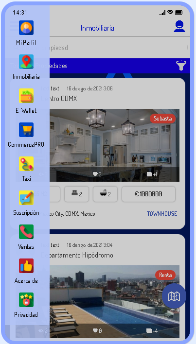
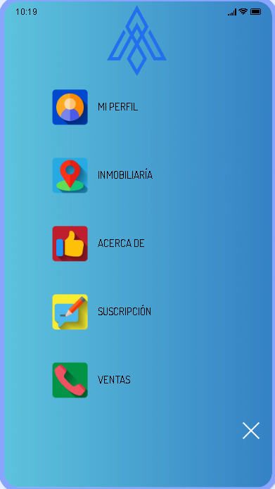
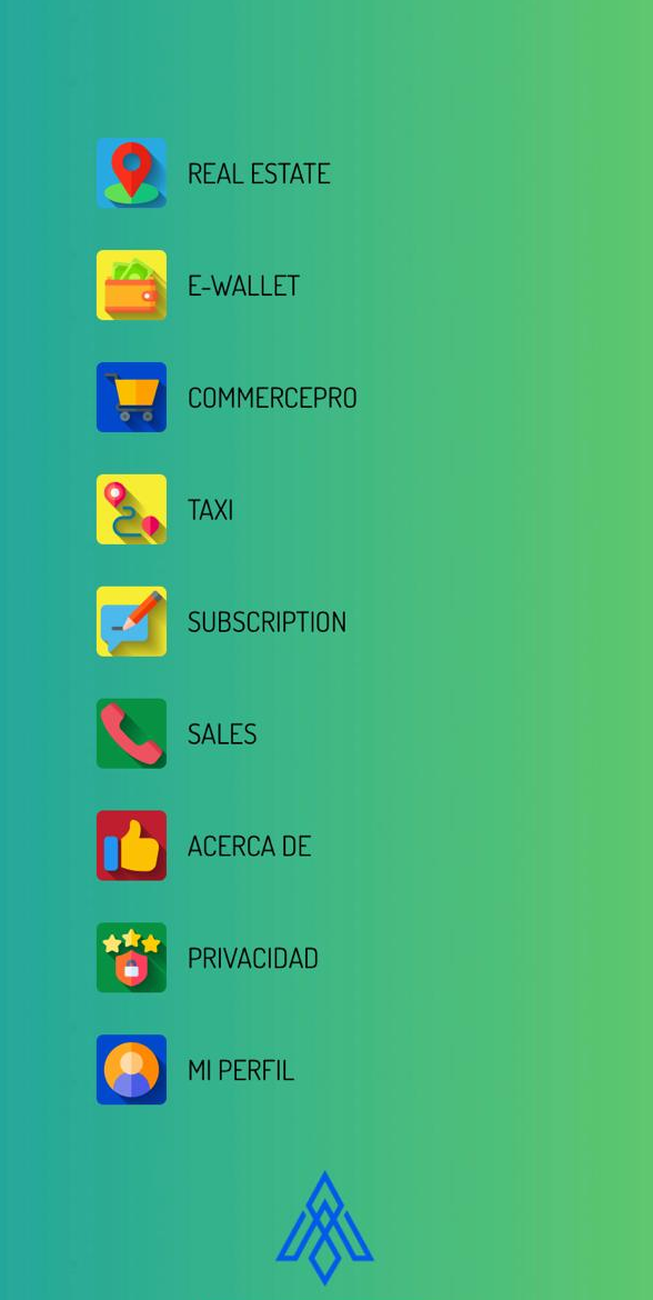
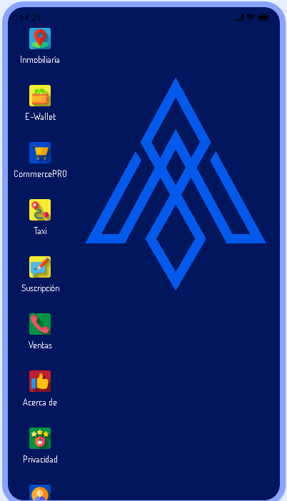
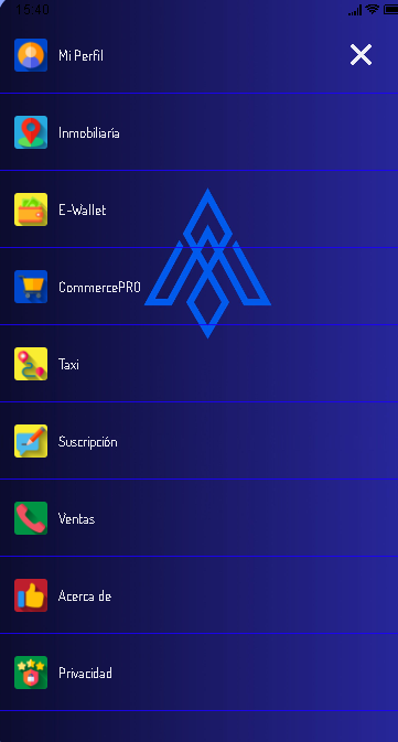
This layout opens the first module you have to the left of your installed modules. It is accessed through the hamburger menu, which are the three lines at the top left, and when you press it, a menu is displayed on the left side of the screen where all your modules are displayed.
Layout with a bar at the bottom of the screen. It is possible to display four modules permanently and display a button in the central part to access the different modules that you have added. It has a slider or carousel of images.
In this Layout your modules are displayed on the main screen in the form of boxes, in this specific layout the modules occupy the entire main screen. This Layout has no options.
In this Layout your modules are displayed on the main screen in the form of boxes, in this specific layout the modules occupy the entire main screen. This Layout has no options.
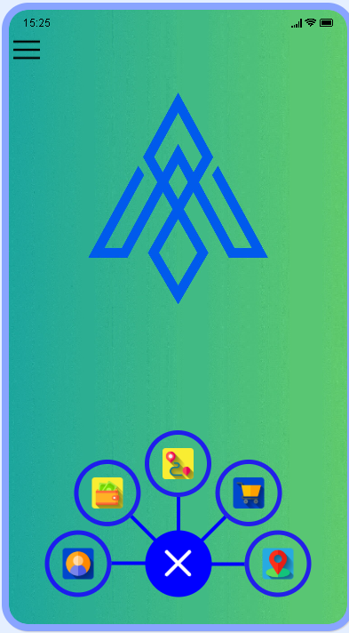
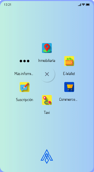
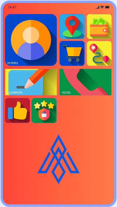
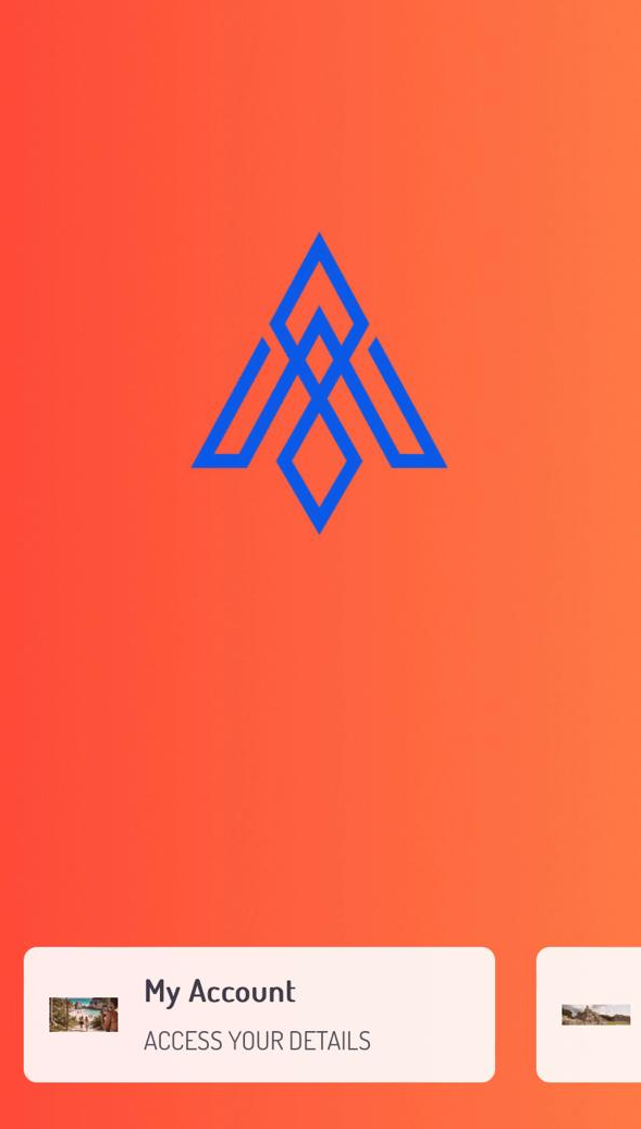
It displays a circle with the plus sign [+] type bubble at the bottom of the screen, which when pressed displays a menu with the modules configured in the shape of a semicircle. You can configure the icons and colors.
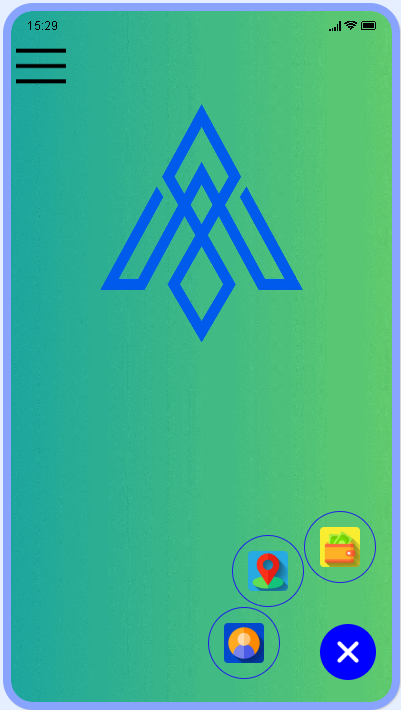
This is a variation of the Branch Menu module, with the difference that the circle is shown at the bottom right. And when you press it, 3 quick access modules are displayed, the other modules can be accessed from the upper left.
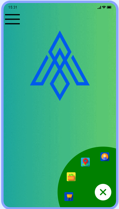
This is a variation of the Fab Menu 3 module, with the difference that 4 quick access modules are shown at the bottom right. And when you press it, 4 quick access modules are displayed, the other modules can be accessed from the upper left.
With this Layout all the modules are shown in the upper left, very similar to Fab Menu 4, with the difference that all the icons of the installed modules are shown.
This Layout has 3 sliders or images that rotate infinitely on the main screen. The menu containing the installed modules is located at the top left in the form of a drop-down menu within the 3 parallel lines. The slider can be hidden or disabled.
Menu in which 2 configurable "sliders" are displayed on the main screen, which can be static images or animated GIFs! The modules are located at the bottom of the screen
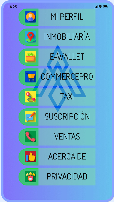
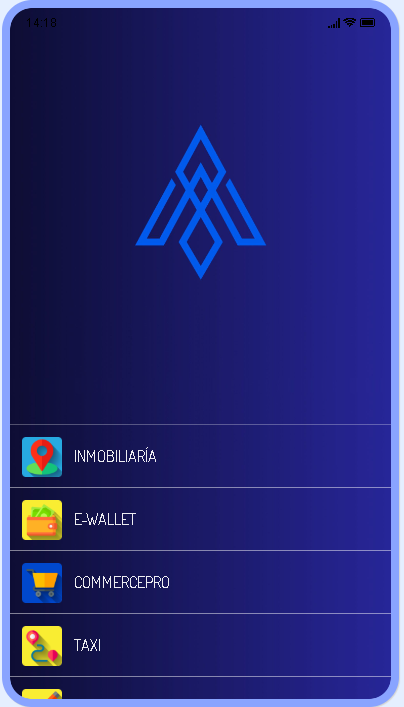
Layout that presents the user with the modules in the form of a list with their respective icons.
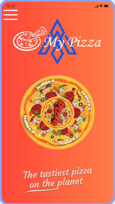
Layout originally aimed at pizzerias restaurants, shows a Pizza on the main screen, which rotates in the center and each slice of the pizza is a feature that can be customized. All images can be replaced. The modules are accessed from the upper left part of the screen through a drop-down bar marked with 3 parallel bars.
Layout that presents a bubble in the lower right part of the screen, when pressed it displays a radial menu at the top of the screen, and it also displays in the shape of a crescent in the upper center of the screen.
Layout that forcibly shows three sliders that move on the main screen of the app, your users can skip the sliders and go to the modules screen, and once on the modules screen they can return to the sliders if they wish. they want it. Sliders can be animated GIFs. The modules are contained and will be displayed on the main screen in the form of boxes
This Layout presents a screen with an image and access to two icons where the user can link to WhatsApp, a website, or dial a predetermined phone number. The modules are accessed using the + sign as shown in the image. A background image is displayed that can be linked to any site on the web. In addition to that, a title and subtitle can be configured on the main screen. The configured modules will be displayed when you press the plus button (+) on the screen.
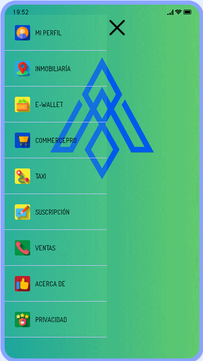
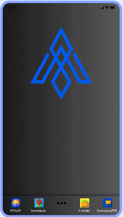
This Layout displays the first five modules in a bar at the bottom of the screen. In addition to this, we can access the modules by pressing the 3 parallel bars at the top left of the screen. Doing so shows the modules in the form of a bar. on the left side of the screen in list form.
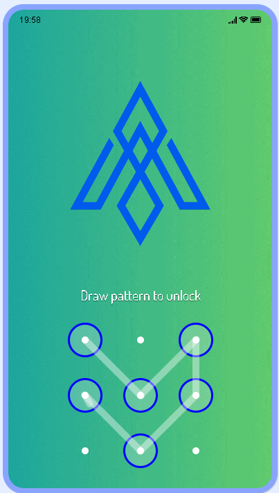
This Layout features a combination lock that will have to be opened to access the application. Ideal for private Apps where absolute privacy is required and keeping verified users with access to the App. All colors and texts can be changed.
This Layout shows advertising or configurable "AD", when jumping to the AD the previously installed modules are displayed, these are presented in the form of a list in the central part of the screen. The initial ad screen can be disabled to directly access the installed modules.
With this Layout each module is shown on a different screen or "Slide".
In this module we see the divided screen, in the upper part of this we can configure a title and a subtitle, and in the lower part of the screen we see the installed modules in the form of a list, the titles of the modules can be configured a subtitle. The list scrolls vertically.
In this Layout, each module is displayed in a box with its name, your configuration options are the images, titles, and pixel size of the font, and information and access icon options.
In this layout it can be configured to integrate a video that plays constantly on the main screen, the video cannot be stopped and must be hosted on an HTTP site with permissions to be played without special prerequisites and for all audiences. The modules of the app can be viewed by accessing the button at the bottom right of the screen, in which you can see 3 parallel bars. When you press it, the modules are displayed in the central part of the screen in the form of a list.
Minimalist layout in which the modules are displayed within a box in the center of the main screen
Layout that allows you to add videos to your main screen, the configured modules can be viewed by pressing the button at the top left of the screen identified with three parallel bars, this menu is commonly known as "Hamburger Menu." This Layout is not ideal for transmitting long, high-quality videos, for that we recommend the Editor's Denteo Videos module. This module is for short 5 or 10 second videos to promote or show things specifically about your Apps.
General Layout, in which the screen is divided into 2 parts, the upper part is differentiated by being able to configure an image or photo of our preference, in the lower part, we can view the modules that were installed in the form of a list that we can move from left to right.
This module is similar to the MEEM module, where each module is displayed in a box with its name, your configuration options are the images, titles, and font pixel size. You can activate dark mode.
In this module, each module is presented in full screen, each of the modules can configure a fully editable image or photo. The modules installed in your Apps slide horizontally.
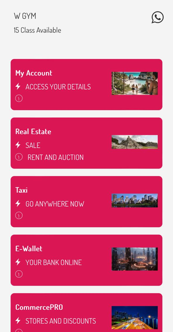
With this Layout you will see your modules inside the boxes. You can configure an image or photo of each of the modules, as well as a subtitle if required, to view the modules we can move them in the form of a list with vertical mobility
Layout that adapts to many cases, a title is displayed at the top of the main screen, and the background image is presented in full screen. To access your installed modules, you must access the plus icon (+) that is located at the bottom center of the screen. When you press it, the modules will be displayed in the form of a list. The bottom bar can be configured to add modules to offer direct and immediate access to modules.
With this Layout you will show your modules in the form of a list with a small icon that identifies each one. This layout allows you to configure a Title and subtitle for each installed module.
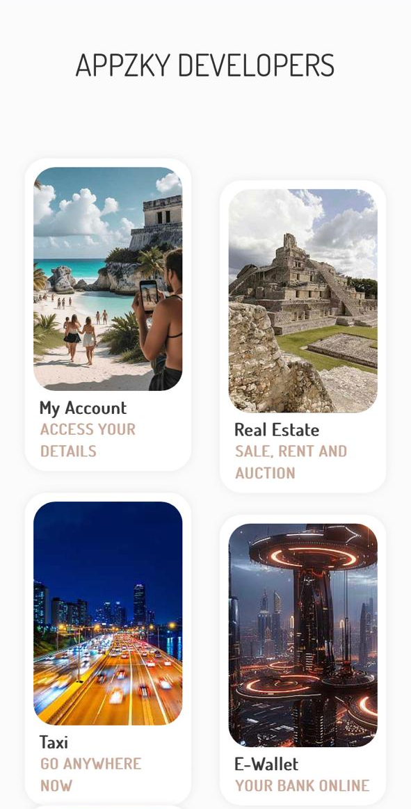
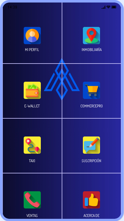
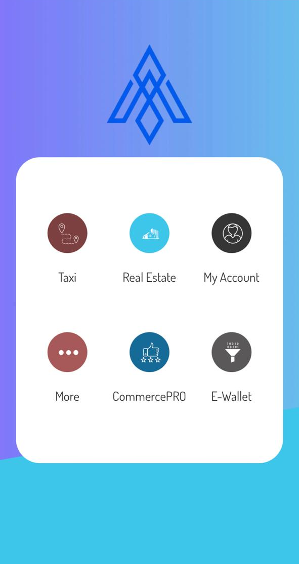
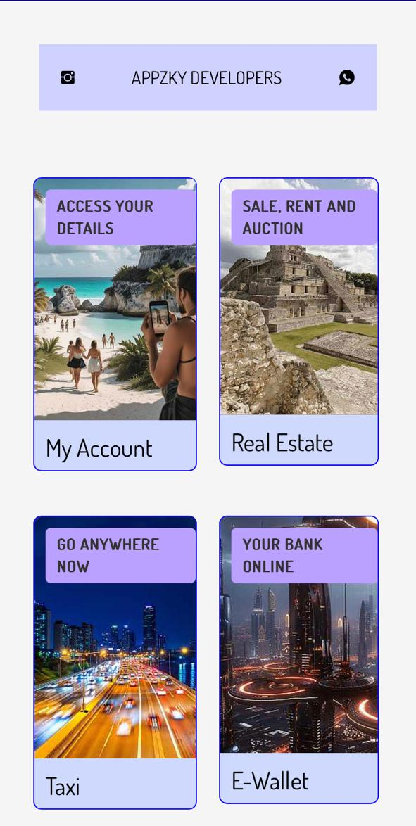
General Layout, in which a title or subtitle can be configured on the main page, the modules are displayed in the form of a grid, in which an image can be configured for each module, in addition to a title and subtitle if required

With this Layout you can convert any website into an App. If you or your clients already have a website, with this layout you transform them into Apps just by pasting the URL
With this Layout your installed modules are shown in the form of animated pop-ups at the bottom of the screen, the background can be a video or an image.
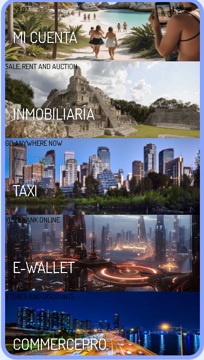
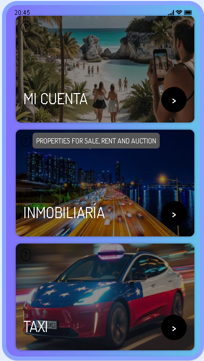
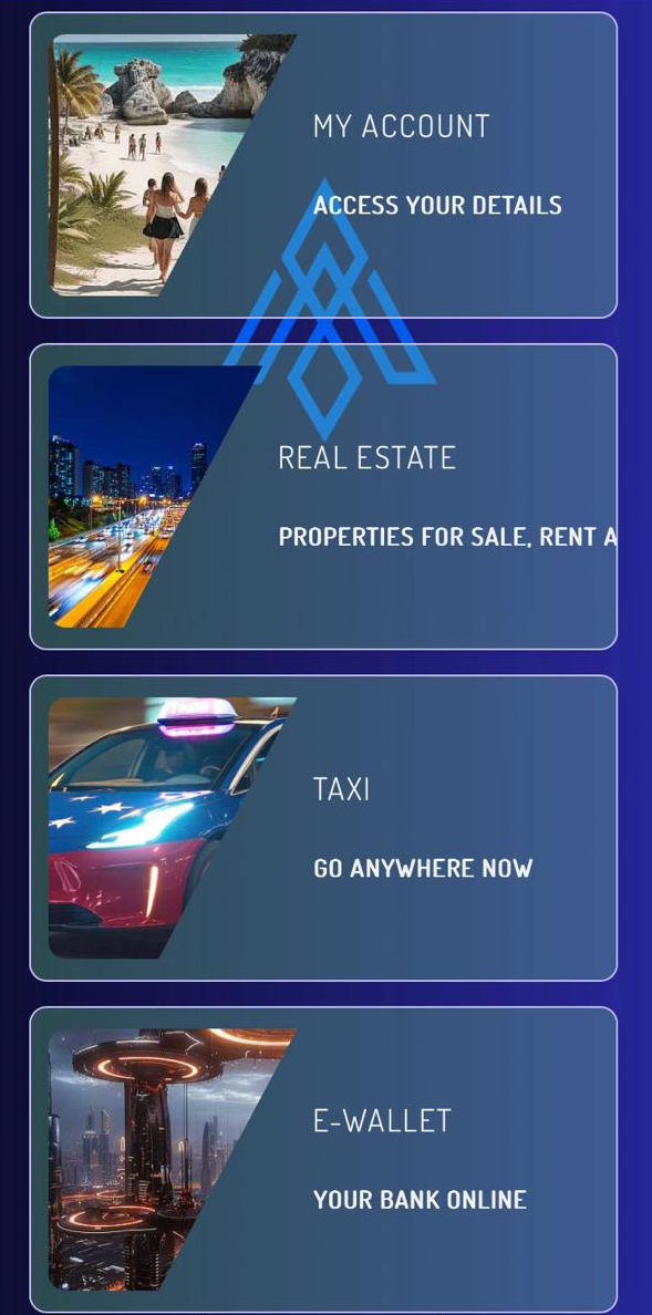
It allows you to use the full screen to show your installed modules in the form of a list along with a representative image of it, ideal for all types of Apps that offer multiple services or activities in a single App.
This is a Layout suitable for all types of App in general, it allows you to show the installed modules in the form of an interactive list, this layout allows you to edit their titles and descriptions. You can change the size of the font, the screen background and the icons.

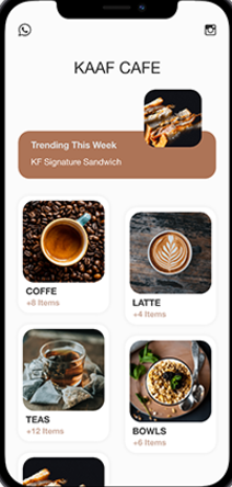
Completely dynamic layout, which highlights the functionality of the CommercePRO module, gives your users quick access to products, stores and categories. If you have restaurant or store apps, this is the ideal one to accelerate your sales.
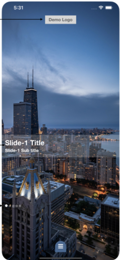
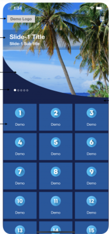
This is a high-end and professional looking Layout that presents your users with an image slider that takes up the entire screen, allowing you to add a title and subtitle to each image in the slider. And the installed modules are accessed through the bars located at the bottom of the slider, displaying all your modules in the form of rectangular buttons with rounded corners.
Highly versatile, although this Layout is similar to the S31, it has the difference that the screen is divided into two and the slider images are presented on 50% of the screen. The icons of your modules are presented on the main screen to facilitate direct and immediate access to the functions of your Apps.
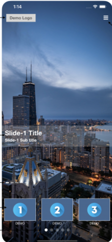
A very interesting variation to Layouts S31 and S35, where the first three modules are shown at the bottom for immediate access and the other modules are accessed through the slider horizontally.
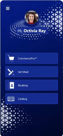
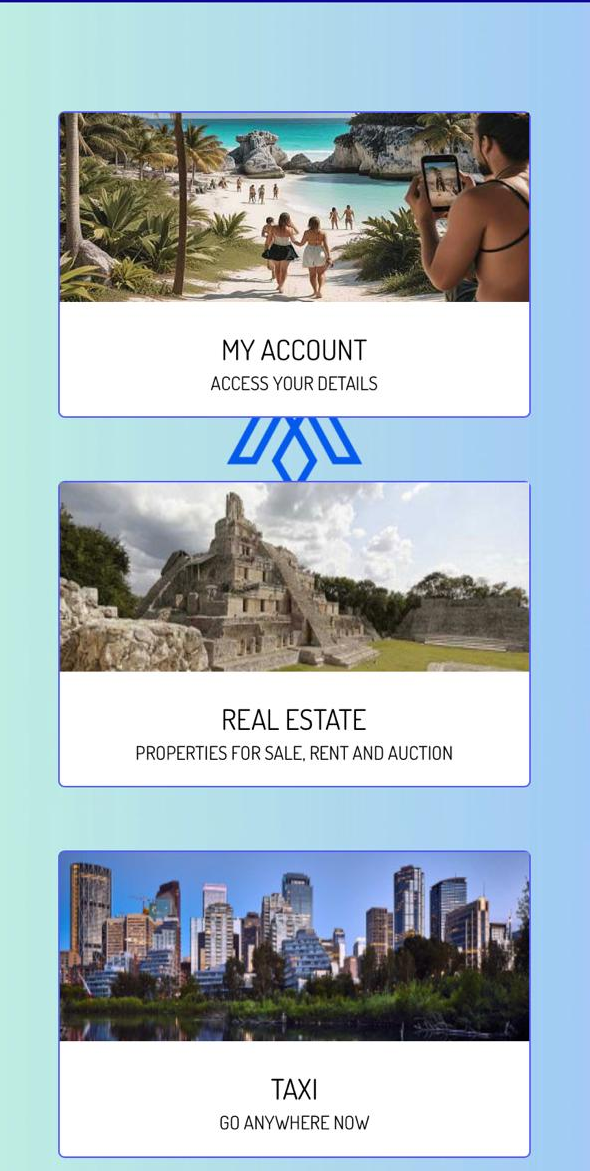
With this Layout Card, or type of business card, the photo taken from the "My Account" module and the name are displayed to generate an experience of belonging to your Apps, with a predetermined greeting to maintain a friendly environment. The modules are shown at the bottom of the screen in boxes.
A progressive and modern layout that features modules installed prominently across the screen. The icons at the top are configurable, you can change the image and the link, for example, you can integrate a link to your WhatsApp, your website or direct call to your customer service number. You can modify the size of the letters in pixels and also the colors of the backgrounds of both the header and the text,
A Layout similar to RAWA but with the difference of being able to show more installed modules and also the additional variation to show a single line of your modules with a larger presentation, to access the modules you simply slide vertically.